
How to use
the brand.
For press, partners, and integration authors. The brand reads as brutalist editorial — cream surface, ink rules, signal yellow accents, hard corners, and the rail cross-section mark. Hold the line and it stays recognizable; bend it and it stops being us.
A rail. A section.
The mark is a railroad rail cross-section: engineered, structural, and built to bear load. Use the exported master; do not redraw the rail from CSS or text.
56u
100u
20u
30u
52u
32u
4u
Logo.


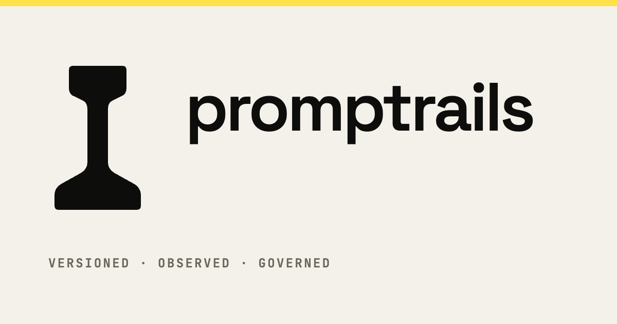
The rail cross-section is the master mark. Use the exported SVG directly for icons, favicons, and compact brand moments; do not redraw it from CSS or text.
Approved lockups
Default for press, partner pages, and broad brand moments.
Square canvases where the horizontal lockup loses presence.
Avatars, favicons, app icons, and known-brand contexts.
Headers and tight horizontal spaces under 32px tall.
When the mark won't fit but the name still needs to read.
Chips, status labels, and inline text treatments.
Clear space & minimum size
Keep one rail-head width of clear space on every side. The foot's outer corner is the spacing unit. No type, images, or partner marks should enter that zone.
Favicon and app icon minimum.
Header and navigation minimum.
Business cards, stamps, and compact print.
Do · Don't
- ✓Use the primary horizontal lockup first, especially for partner and press pages.
- ✓Use the compact navigation lockup only where vertical space is tight.
- ✓Keep at least 0.5× logo-height padding around any lockup.
- ✓Use the inverse cream lockup on ink or other dark surfaces.
- ✕Place on busy photographs or low-contrast brand colors.
- ✕Use the rail mark alone when the audience may not already know PromptRails.
- ✕Squash, stretch, rotate, recolor, or add gradients.
- ✕Apply drop shadows, glows, or 3D effects.
Source files are available below as SVG, PNG, favicon, and token exports.
Default lockup for press, partner pages, and broad brand moments.
Cream lockup for ink or dark surfaces.
Navigation bars and tight horizontal placements.
App icons, favicons, and small brand identifiers.
1200 x 630 social sharing preview.
Machine-readable brand palette.
Approved inline lockup for chips, labels, and status contexts.
Palette.
Ink and cream do the work. Signal yellow earns its keep one place at a time: never as a logo color, never as a body-text background, and usually under 10% of the surface.
Typography.
H1, H2, big quotes. Italic for accents. Variable optical-size axis tuned to 144.
Paragraphs, body copy, buttons, lede.
Eyebrows, status labels, code, tags. Always uppercase with 0.06–0.22em tracking when used as an eyebrow.
Voice & tone.
Direct, technical, slightly editorial. Sentences are short. Numbers earn their place. Marketing-speak gets the boot.
- ✓Specific. Verbs. Numbers.
- ✓"Ship a traced agent in 5 minutes."
- ✓Concrete benefits ("p99 < 18ms gateway overhead").
- ✓Confess tradeoffs ("we charge for runs, not seats").
- ✓Reference the open-source story (langrails) when relevant.
- ✕Marketing fluff. Synergy. Empower.
- ✕"Accelerate your AI transformation journey."
- ✕Vague claims ("blazing fast performance").
- ✕Pretend we replaced ten tools with no caveats.
- ✕Hide the OSS underneath. It’s the moat.
Digital surfaces.
Use favicon masters at 16 / 32 / 48 px. Do not resize the print SVG down.
Ink ground with signal or cream rail mark; keep the icon field simple.
Use the mark alone in circular crops; avoid full lockups at small sizes.
Use the 1200 x 630 social card system with ink ground and signal accent.
Boilerplate.
Copy this as the standard one-liner for press, partner pages, and conference bios.
Press kit.
For screenshots, founder photos, or custom press materials beyond the public brand exports, contact hello@promptrails.ai.